Quicken
Designing content across a growing fintech ecosystem
Personal finance is regulated, technical, and easy to get wrong. Through a company-wide rebrand and three product launches, I helped shape the messaging, UX content, voice rules, and reusable content patterns that kept a complex product ecosystem clear and consistent for millions of users.
- Company
- Quicken
- When
- 2022 – 2026
- My role
- Senior content strategist and UX writer
- I owned
- Messaging hierarchy and copy, UX copy, voice rules, and reusable content patterns
- Collaborators
- Product marketing, product design, UX, and compliance
- Status
- Shipped
A1
The problem
A legacy desktop brand was becoming a multi-product fintech platform, and its language hadn't caught up.
For decades, Quicken meant boxed software, desktop finance tools, and a red logo on the shelf. As it grew into a digital-first platform with several products, each with its own audiences, the old feature-first, transactional language no longer reflected the experience or the ambition. The company-wide rebrand in 2023 reset that, and I was part of the team that carried it into product, web, and lifecycle content.
Every word also had to survive a regulated environment: clear, accurate, and approved by compliance, without losing warmth.
A2
The homepage
Feature lists became outcomes. By 2025, the homepage led with one promise, four pillars under it, and proof under each.
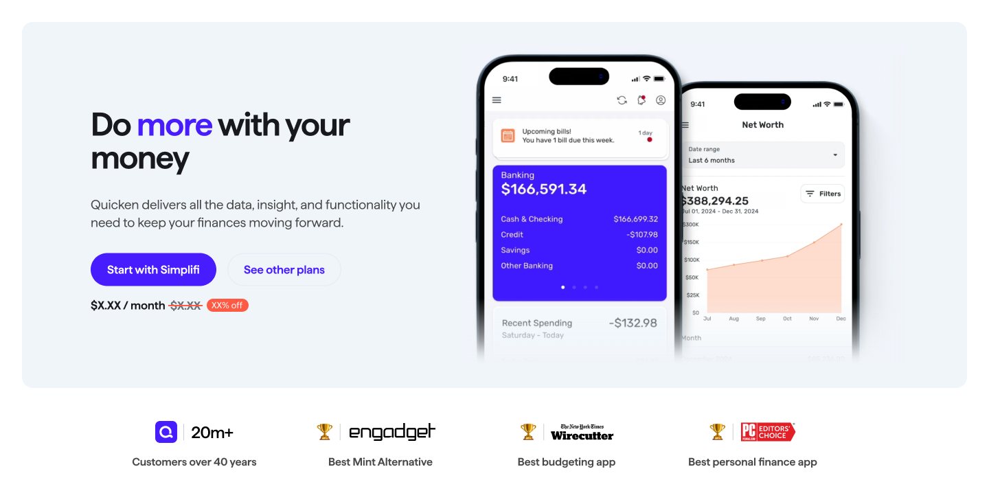
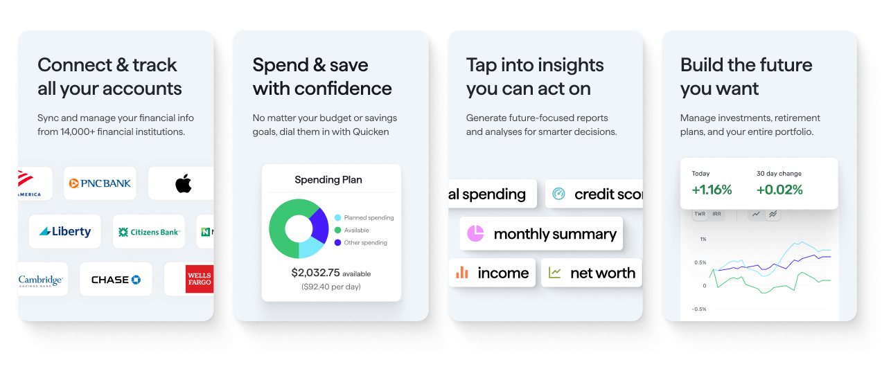
I grounded language decisions in user intent rather than feature exposition: simplifying financial concepts, prioritizing outcomes over functionality, and writing copy that felt supportive rather than instructional. I worked closely with design so words and visuals could each carry the story, and iterated with compliance to keep clarity without giving up warmth.
What was mine. I wrote the messaging hierarchy and copy: the top-level promise, four supporting pillars, proof points, section narrative, and calls to action, developing them with product marketing, design, and compliance. The design team owned the visual system, page composition, responsive behavior, and final UI execution. We iterated together in Figma so the words and visual hierarchy supported the same story.
A3
The launches
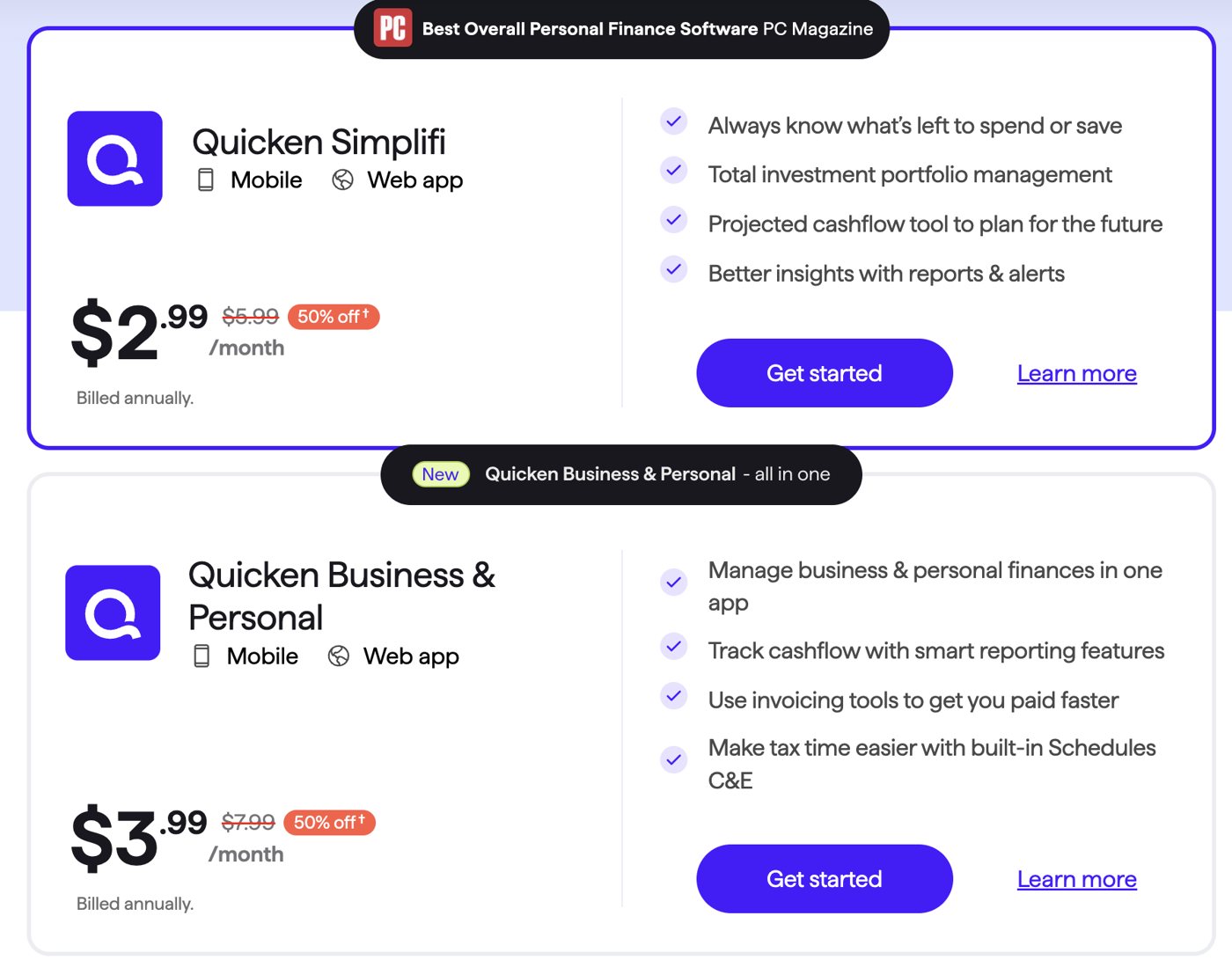
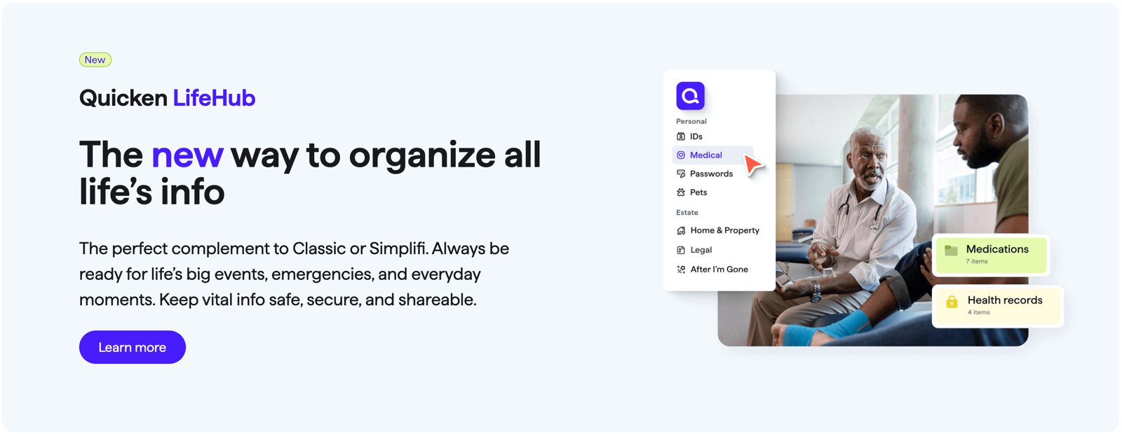
Three launches: Quicken Simplifi, then Quicken Business & Personal and Quicken LifeHub in late 2025. Each needed messaging that made it read as distinct, and all three beat their launch forecasts.
- Quicken SimplifiEveryday money, looking ahead
The messaging leads with outcomes people feel every day: always know what's left to spend or save, and see where cash flow is heading.
- Quicken Business & PersonalOne app, kept separate
The messaging names the problem directly: business and personal finances in one app, with nothing mixed up. The proof is concrete: invoicing, cash flow reporting, and Schedules C and E at tax time.
- Quicken LifeHubThe complement, not a competitor
A product that isn't about money had to sit inside a money brand. The line that drew the boundary: "Quicken Simplifi handles the money. Quicken LifeHub handles everything else."
B1
The component system
One feature message, built once as a set of modules, then reused across web, lifecycle email and social.
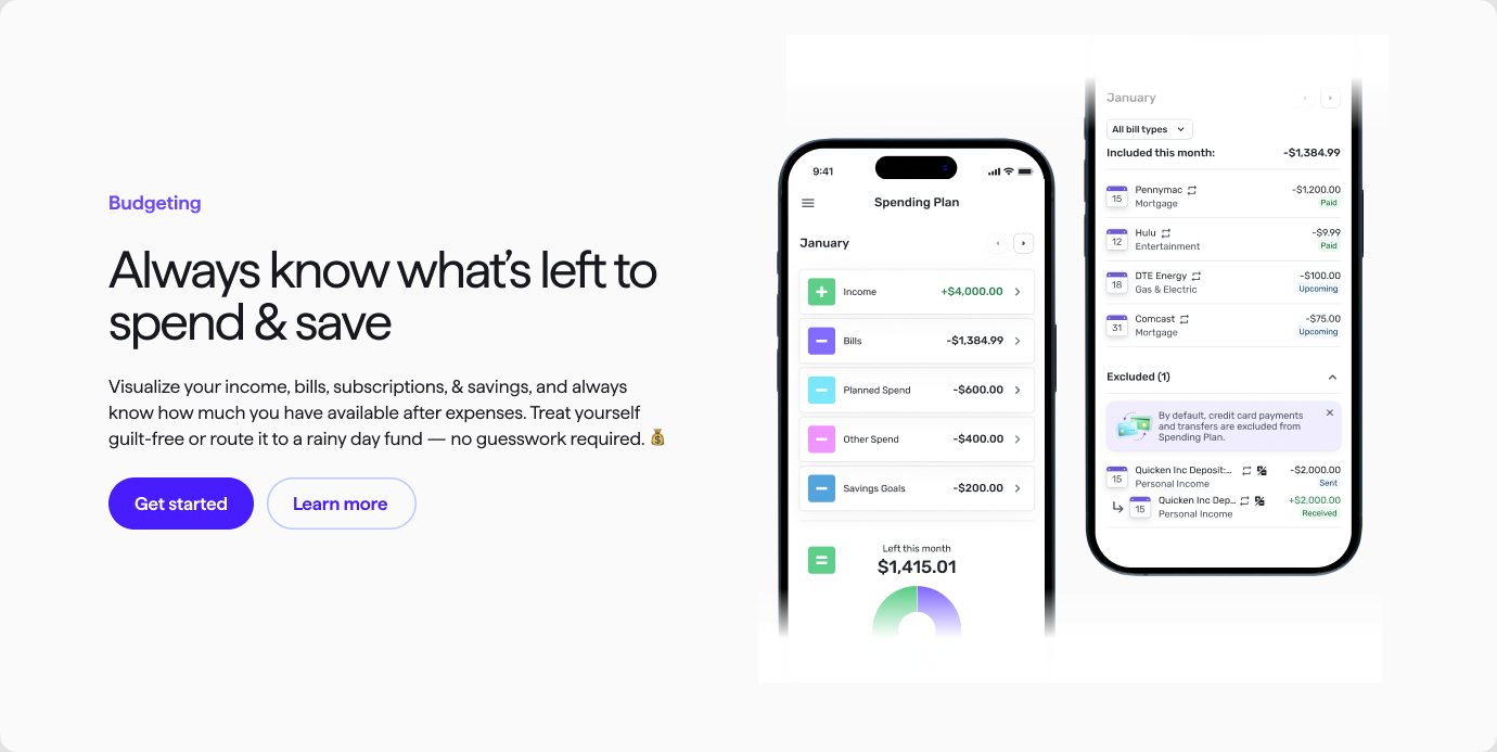
WebThe Spending Plan feature module. Eyebrow, promise, benefit, action: the same anatomy every feature follows, in duplex, accordion and card layouts.
- Card
- Subheading block
- Text over image
- Icon list, checks
- Icon blurbs
- Side by side
- Headline, card, CTA
- Blocks
- Icon list with image
EmailNine lifecycle email module types for the same feature, each built for desktop (600px) and mobile (320px), so any email could be assembled from approved parts.
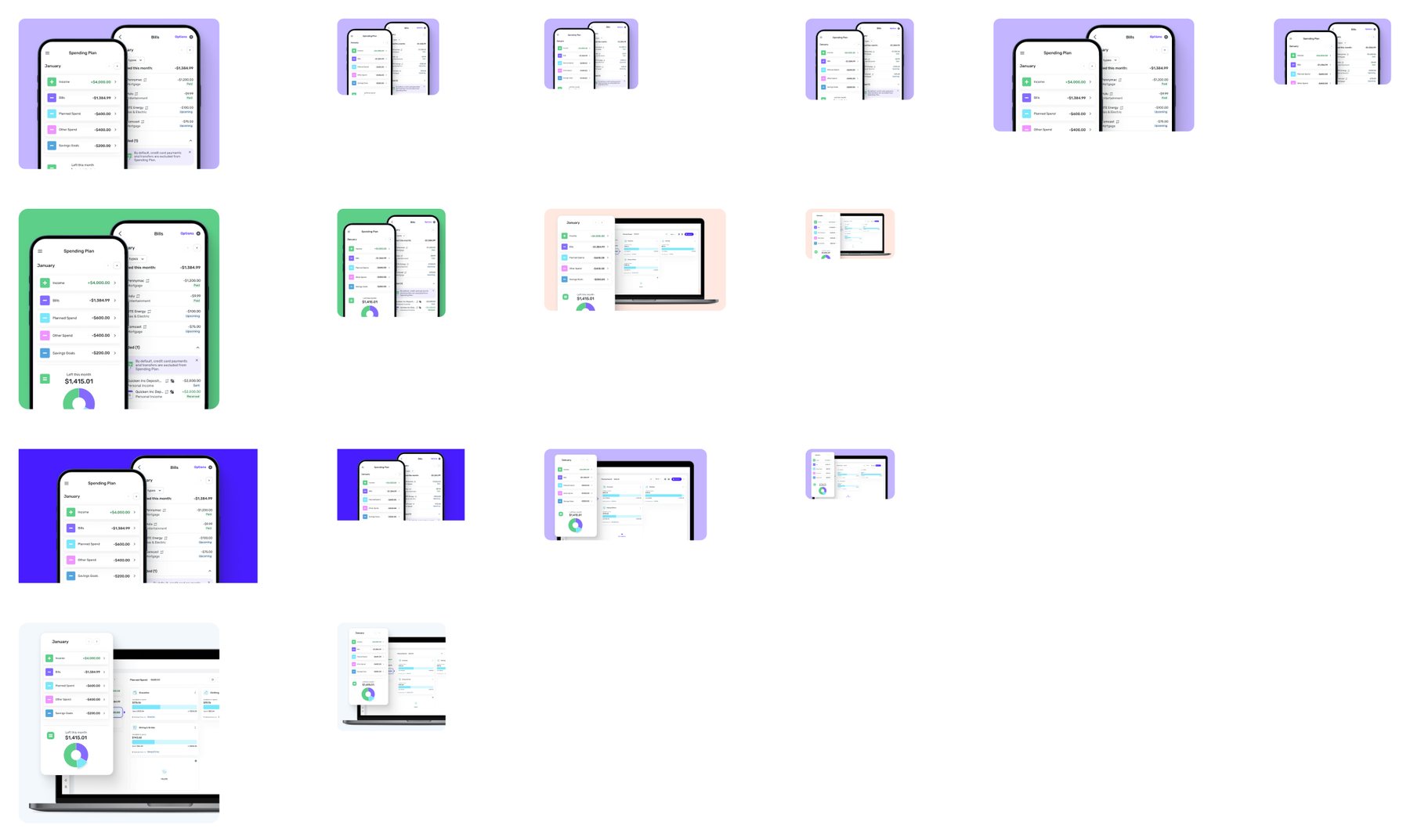
AssetsOne product story rendered as a family of images: several brand colors, every size the channels needed.
Before the system, each channel rebuilt the same feature story from scratch. With a shared set of modules, web, lifecycle and social could all pull from the same approved message and layout logic: faster production, consistent content, and room to scale across more than one product line.
What was mine. I defined the content anatomy and editorial rules: what each module needed to communicate, the copy hierarchy, naming, approved variants, and how one product story should adapt across web, lifecycle email, and social. The design team created the visual components and production assets. I wrote and populated the modules and worked with the designers to make sure the patterns held across formats.
B2
Methodology
Lead with the outcome. Build a hierarchy, not a pile of claims. Write it once and reuse it everywhere.
Outcomes over features
Say what changes in someone's financial life, then show the feature that does it.
A hierarchy, not a pile of claims
One promise per page, pillars that ladder to it, and proof under each pillar.
Write once, reuse everywhere
Feature messaging lives in modules that web, email and social can all assemble from.
Voice that survives compliance
Clear, accurate and warm, iterated with compliance instead of sanded down by it.
AI as an accelerator, not the author
I built reusable LLM workflows grounded in product facts, positioning, and editorial rules to accelerate ideation and QA. Human editorial judgment remained responsible for every final line.
B3
Outcome
A modernized brand, clearer products, and a content system teams could build on instead of rebuilding.
B4
Reflection
The launches beat forecast, but the more durable result was a content foundation teams could reuse instead of rebuilding.
If I did this again, I'd establish the shared content system and its governance earlier. The rebrand, product launches, and channel work were happening under active deadlines, so parts of the system emerged while we were already using them. I would create a canonical source of truth for positioning, approved proof points, reusable modules, and ownership sooner, making it easier for teams to build consistently without reopening the same language decisions.
I'm proudest of helping a complex, regulated product ecosystem speak with greater clarity without flattening the products or overpromising. The work held together across the homepage, product launches, onboarding, lifecycle, and social, while giving each new product a distinct reason to exist. All three launches exceeded their forecasts, but the more durable result was a content foundation teams could reuse instead of rebuilding from scratch.