Quicken
Turning audience insight into video and paid social
A remarketing campaign built on one idea: see what's next for your money. I led the concepts, copy and art direction, split the message for two very different audiences, and scaled it into a system of 54 statics plus video that ran on paid social.
- Company
- Quicken
- When
- Early 2026
- My role
- Creative lead
- I owned
- Audience strategy, campaign platform, concepts, copy, art direction, and production across statics and video
- Collaborators
- Graphic and motion designers on a five-person creative team
- Final approval
- Creative director, VP of product marketing, and CMO
- Status
- Ran on paid social
A1
The brief
Most finance apps show you where your money went. Quicken could show where it's going.
The campaign was built around predictive visibility: projected cash flow, a Spending Plan that shows what's left, and investment and retirement scenarios you can model ahead of time.
The feeling we were selling mattered as much as the features. The emotional line on the board: Confidence replaces second-guessing. Decisions feel intentional, not reactive.
A2
Two audiences
Same product, two different frustrations. One group was missing the full picture. The other had outgrown looking backward.
Feeders
Use adjacent financial apps and manage pieces of their money, but lack one unified view. They want clarity: spending, saving, investing and planning in one place.
Lead line
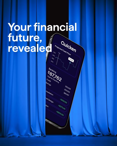
“Your financial future, revealed.”
Switchers
Use single-purpose budgeting or tracking apps and have outgrown them. They want to look ahead, not just back.
Lead line
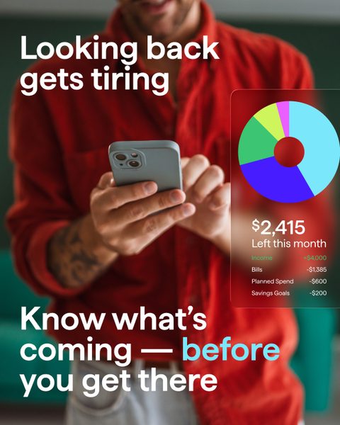
“Looking back gets tiring. Know what's coming, before you get there.”

Splitting by audience changed what each headline had to do. Feeders needed to hear that the scattered pieces could come together. Switchers needed a gentle jab at the tool they already had. The sharpest version of that: Historical views of your money is, well… history.
A3
The matrix
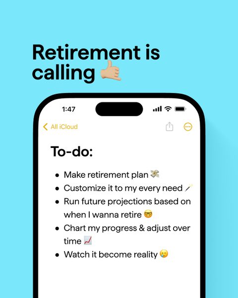
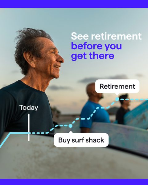
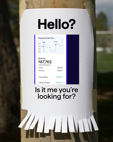
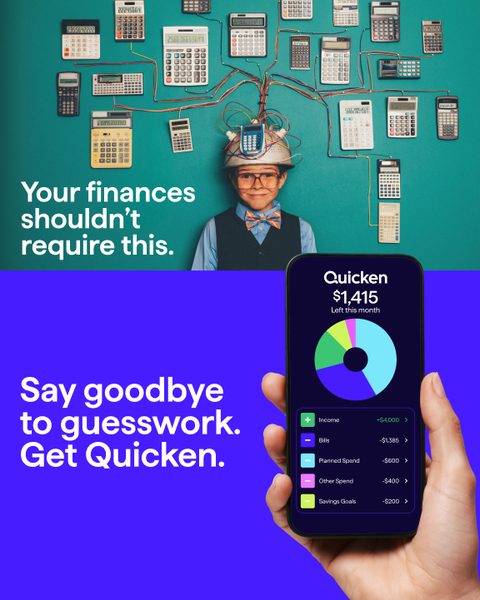
Three message pillars, three concepts each, written twice. Flip between audiences to see the same slot answered two ways.
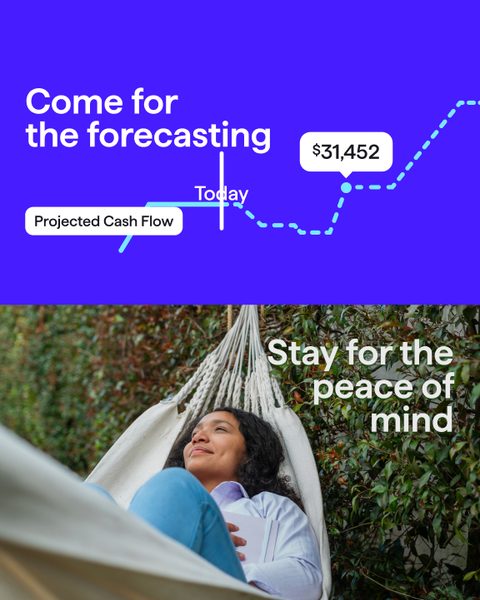
Pillar 1See your runway

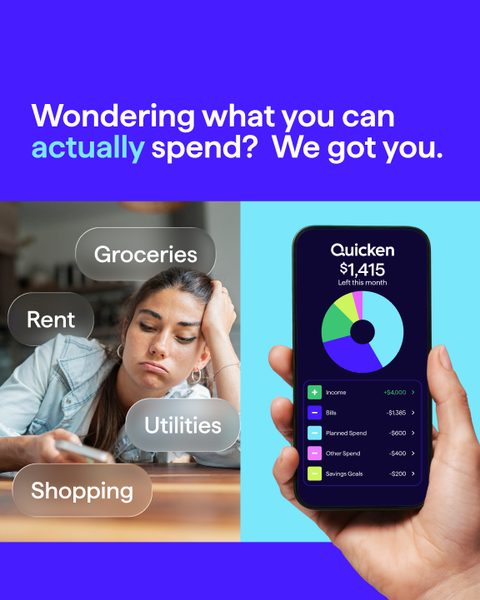
Pillar 2Know what's available

Pillar 3Model investment & retirement

Pillar 1See your runway

Pillar 2Know what's available


Pillar 3Model investment & retirement

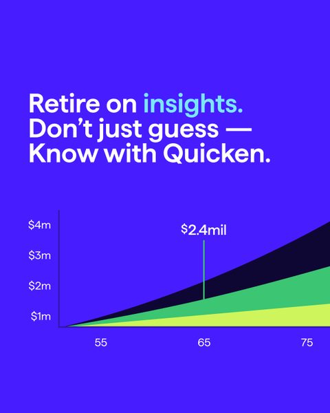

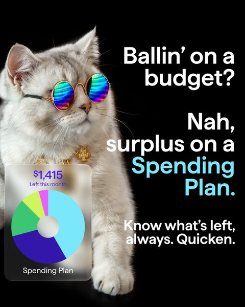
Fig. A3.1All 18 final concepts in 4×5. Columns A to C run from straight product proof to the playful swing.
B1
Rough to final
Concepts started as copy on a gray card, so the line had to earn its place before the art direction arrived.
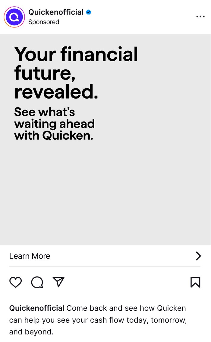
I wrote the line and tested it without art direction so the concept had to work on its own. Then I art-directed the execution: “revealed” became a stage curtain, and I worked with the graphic and motion designers to carry the idea through production without losing the message.
B2
Video
Each audience got its own spot and its own metaphor for looking ahead: a rocket launch for Feeders, the road ahead for Switchers.
Both spots land on the same promise. The Feeder spot builds to "See your financial flight plan" and "Lift off today." The Switcher spot answers the backward-looking app with "Know what's beyond your financial horizon" and "See what's next."

B3
The system
Nine concepts per audience, each built in 1×1, 4×5 and 9×16, plus in-feed mockups and a storyboard per audience.
B4
Methodology
Name the frustration, keep one idea, and give every pillar more than one way in.
Name the frustration, not the feature
Switchers heard that their app only looks back. Feeders heard that they only had pieces. The feature came second.
One idea, three proofs
Every concept ladders up to seeing what's next, through runway, what's available, or retirement scenarios.
Three swings per pillar
Concepts ranged from straight product proof to the unexpected: a cat in sunglasses, a tear-off poster on a telephone pole.
Build it as a matrix
Two audiences, three pillars, three concepts and three formats, so production could scale to 54 finals without losing the thread.
B5
Outcome
Eighteen concepts shipped in three formats (54 final statics) alongside video. Every concept on the board ran on paid social.
B6
Reflection
The system created scale without making the work feel mechanical. Next time, I'd formalize the rough-to-final process before production.
If I did this again, I'd formalize the rough-to-final decision process before production began. With two audiences, three message pillars, three creative approaches, and three formats, small creative decisions multiplied quickly. I would document what had to remain intact in every concept (the audience tension, product truth, and central promise) while giving the visual team clear room to amplify the idea.
I'm proudest that the system created scale without making the work feel mechanical. Feeders and Switchers received different messages rooted in different frustrations, and each pillar supported everything from direct product proof to stranger, more playful concepts. That structure produced 54 final statics and video while keeping every execution connected to one idea: Quicken helps people see what's next for their money. Every concept on the board ultimately ran.