Ryzer
Designing distinct paths for two audiences on one platform
Coaches and camp operators came to Ryzer to run, market, and manage camps. Athletes and families came to discover and register for them. I redesigned the information architecture, routing, hierarchy, and content so each audience entered the right journey and reached a clear next step.
- Company
- Ryzer, a Scorability company
- When
- 2026 · wireframes June 30 · design August 14
- My role
- Lead content designer
- I owned
- Audience strategy, journey mapping, information architecture, wireframes, page hierarchy, UX copy, and marketing copy
- Collaborators
- Executive stakeholders and visual design
- Status
- Strategic proposal; final production experience took a different direction
A1
The problem
Two audiences, one homepage, and only one of them buys Ryzer’s platform. Coaches want more revenue and less admin. Athletes want the right camp and a chance to be seen.

The existing site leaned on Ryzer’s reputation to do the selling.
A2
The lean
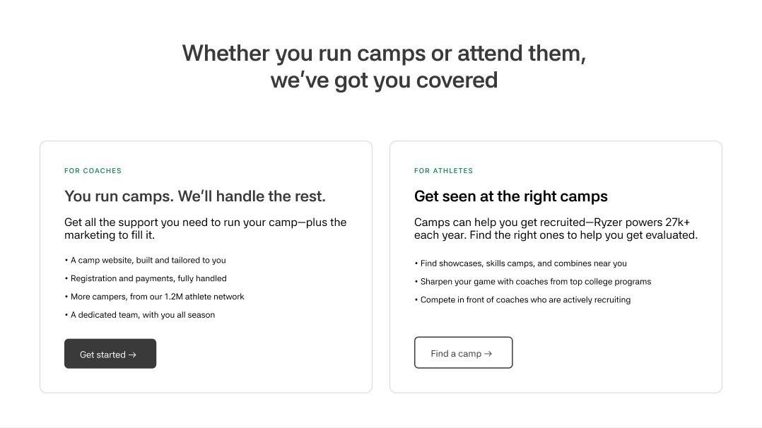
I made coaches and camp operators the primary journey: educate them, build trust, and lead to one clear sales action. Athletes and families received direct wayfinding into camp discovery instead of being forced through a buyer-focused pitch.
A3
Two front doors
Each audience lands on a page written in its own language, with one primary action.
Coaches and camp operators
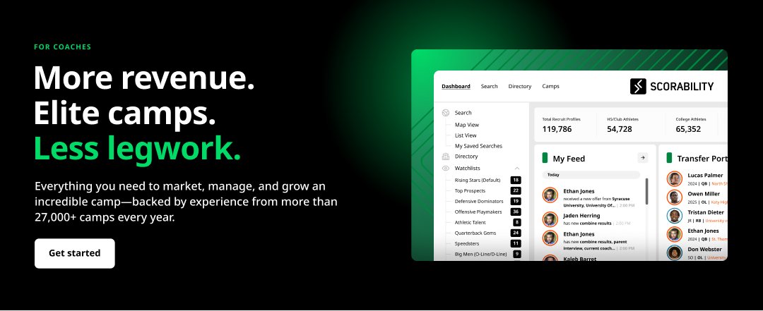
- Speaks toRevenue, time and admin
- ProofSave time · make money · run the best camp
- ActionGet started
Athletes and families
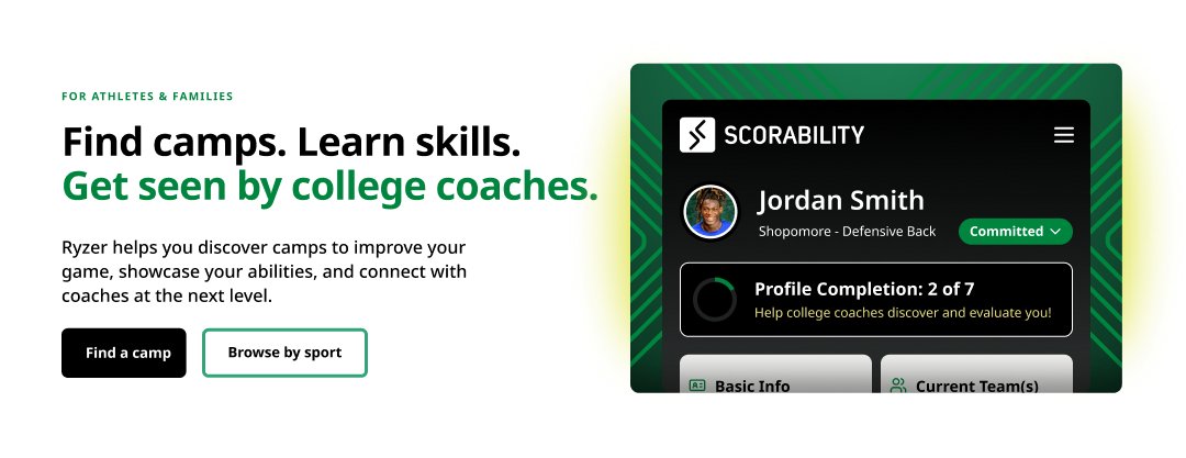
- Speaks toGetting better and getting seen
- ProofRecruiting chances · coaching · verified measurables
- ActionFind a camp
The coach headline focuses on the three outcomes camp operators care about: revenue, camp quality, and less administrative work. “More revenue. Elite camps. Less legwork.” says what improves if they buy Ryzer.
Athletes and families are trying to do something different. “Find camps. Learn skills. Get seen by college coaches.” follows their actual progression from discovery to development to recruiting exposure. The language is more active because they came to the site ready to search.
B1
Methodology
Lead with the buyer. Give everyone else a shortcut. Make Ryzer the obvious answer.
Lead with the buyer
The homepage speaks overwhelmingly to coaches. It educates before it asks, so "Get started" lands as the obvious next step.
Give athletes a shortcut, not a detour
Athletes who arrive get wayfinding (the nav button, their own card, their own closing CTA) that routes them directly to the camp finder.
Speak each audience's language
Coaches hear revenue, time back and less legwork. Athletes hear find, learn and get seen.
One primary action per path
"Get started" for coaches, "Find a camp" for athletes. Even the nav button changes to match the page.
Ship the paths first
V1 covers the core journeys. Search, sport hubs for SEO, recruiting guides and a commitments wall are staged for V2.
What I pushed back on. I pushed back on treating the homepage like an equal-weight product catalog or forcing coaches and athletes through the same story. My wireframe used one coach-led hero and one primary action, with product detail moved into the body and a direct shortcut for athletes entering camp discovery.
B2
The hero, four ways
Leadership chose a four-slide carousel for the design round. I gave each slide one distinct coach reason to buy, so the format still worked as a coherent sequence rather than four competing pitches.
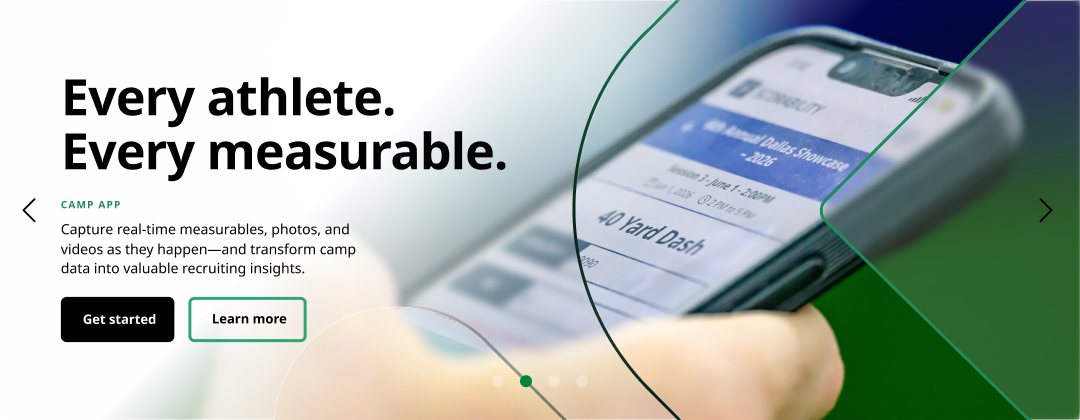
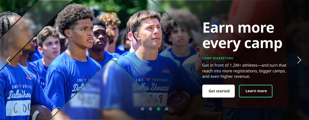
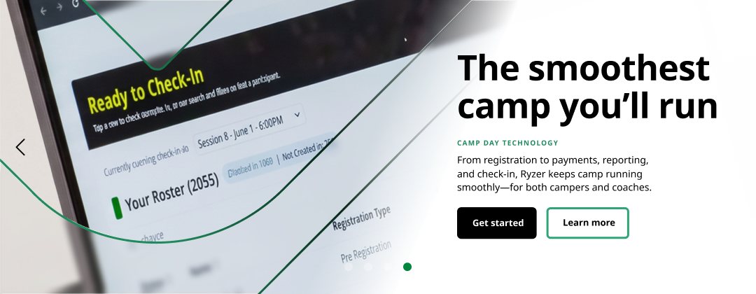
Fig. B2From the design round: the promise, then the camp app, camp marketing and camp-day technology.
B3
Follow the path
Pick an audience and follow it from the homepage to its conversion.
- Homepage"Better camps start here"
- Coach pageMore revenue. Elite camps. Less legwork.
- ProofSave time, make money, run the best camp
- Cross-sellScorability turns camp data into recruiting data
- ConvertGet started: sales form
- HomepageShortcut: "Find a camp" in the nav or the athletes card
- Athlete pageFind camps. Learn skills. Get seen.
- SearchSport, location and date, plus quick filters
- Why campsRecruiting chances, coaching, measurables
- ConvertFind a camp near you
B4
Wireframe to design
From content-first wireframes in June to a designed homepage in August. The structure held; the design gave it a voice.
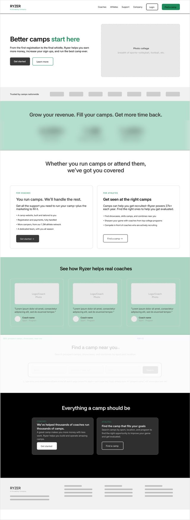
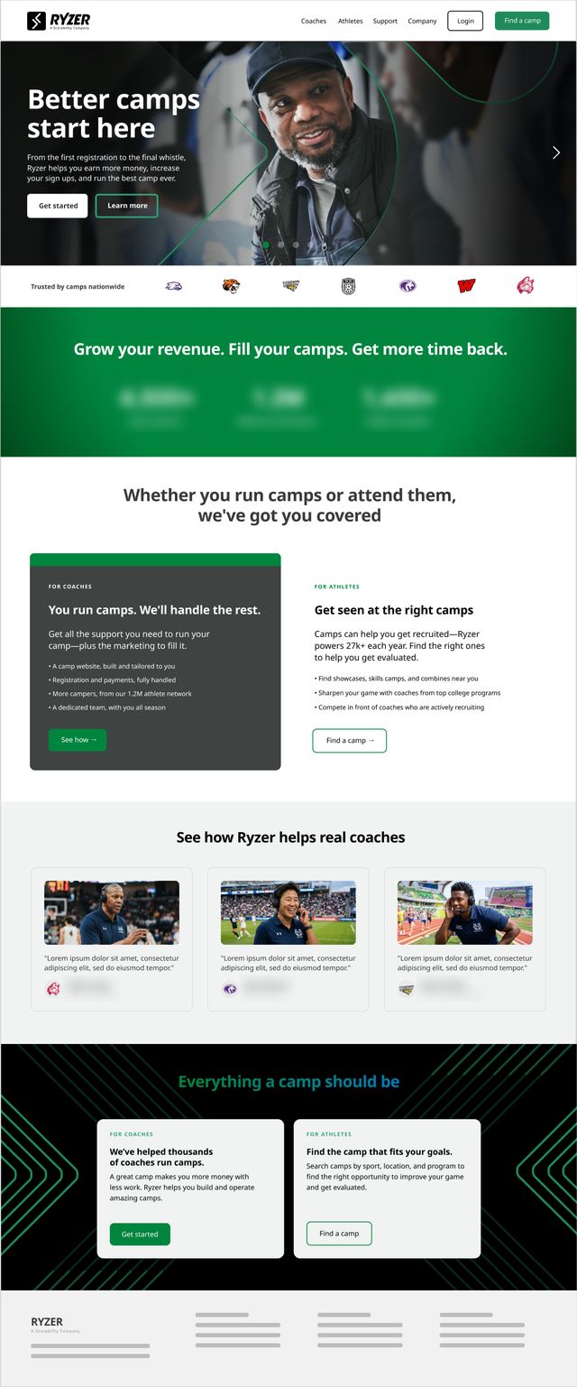
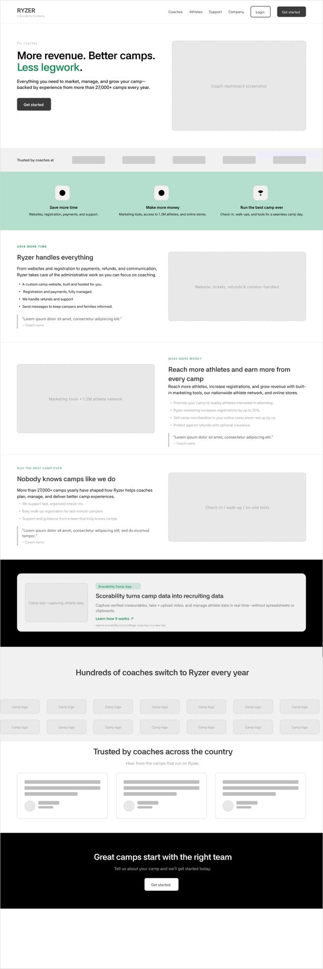
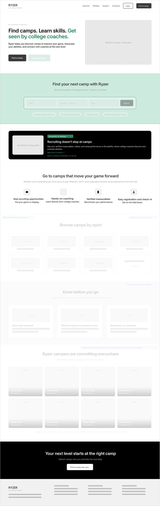
NoteCompany figures on both homepages are blurred. Scroll inside each frame to see the full page. Faded wireframe sections were staged for later.
B5
Outcome
The proposal established a coherent model for separating Ryzer’s buyer and participant journeys.
Coaches moved through education and proof to a sales form, while athletes bypassed the sales story and entered camp discovery. The final site did not ship this system as designed, so this is presented as a strategic proposal rather than a performance case study.
The proposal gave the team a concrete model for separating Ryzer’s buyers from its participants and made the routing tradeoffs visible before development. It did not ship intact, so I would not claim conversion impact. Its value was demonstrating how audience hierarchy, page structure, and calls to action could operate as one coherent system.
B6
Reflection
Two genuinely distinct journeys instead of one generic experience. Next time, I'd align the team on the audience hierarchy before visual design.
If I did this again, I'd align the team around the audience hierarchy before moving into visual design. The site had to serve both coaches and athletes, but those audiences were not equally important on every page. I would document the primary job, audience, and conversion for each section earlier, then use that framework to evaluate later requests, including how much information belonged in the hero.
I'm proudest of creating two genuinely distinct journeys instead of forcing both audiences through one generic experience. Coaches moved through education, proof, and cross-sell toward a sales conversation; athletes and families received direct routes into camp discovery. Although the proposal did not ship intact, the underlying work demonstrates how I turn competing audience needs into clear paths, purposeful page hierarchy, and one next step for each user.